Sponge City
These magazine spreads were created based on a article found on Wired.com that had great context, but deserved a better delivery. In creating type as image for the title, a photoshop collage for the imagery, and an infographic for added information, this article was made to draw in readers. Magazine pages need to be captivating to catch the reader before turning the page. These spreads aim to do just that. Even a not so positive article can be uplifted and inviting with a little bit of design!
Areas of Focus
-
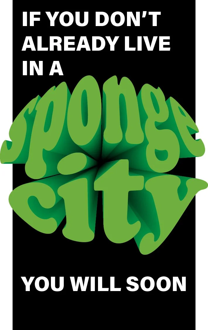
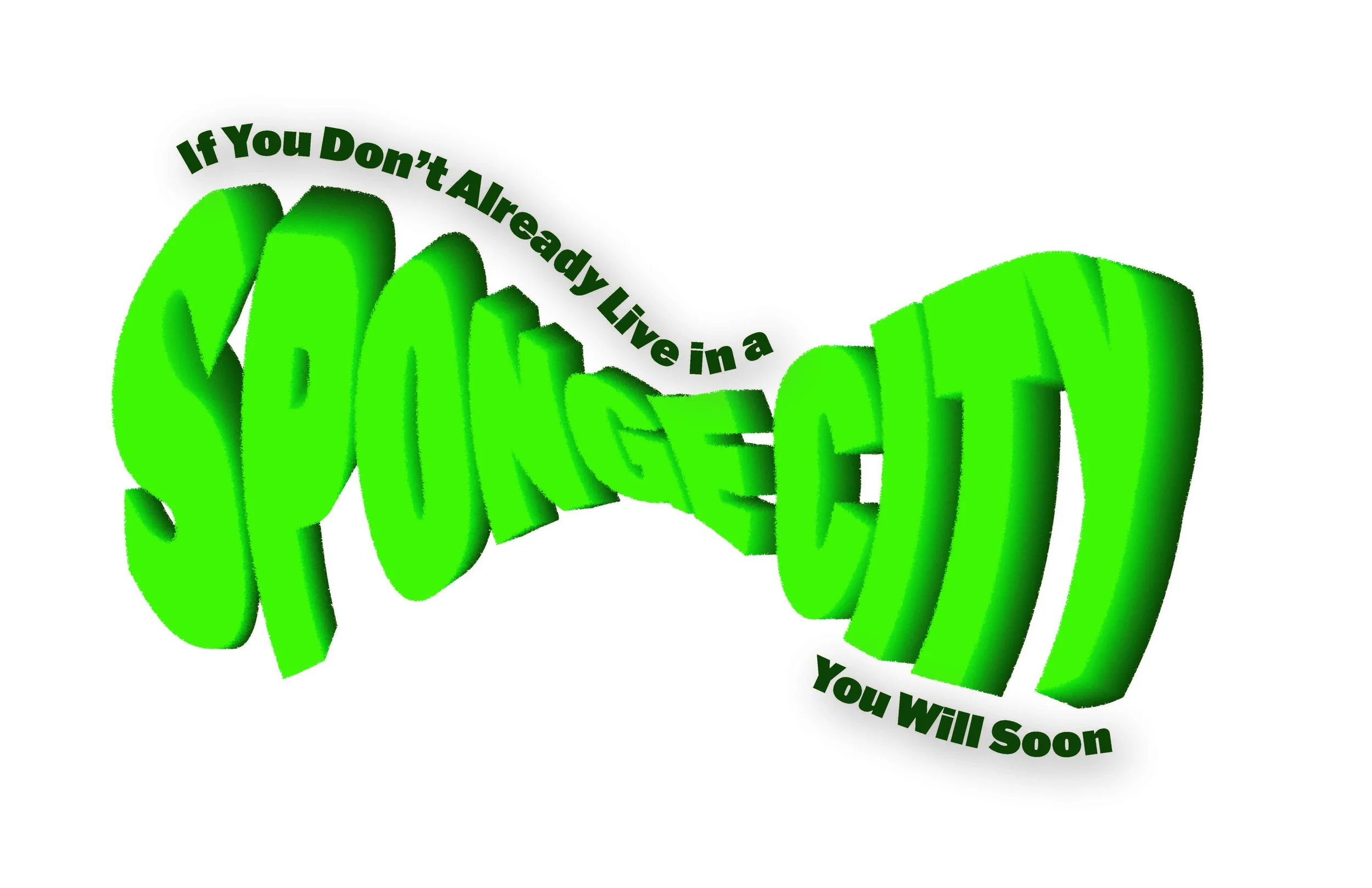
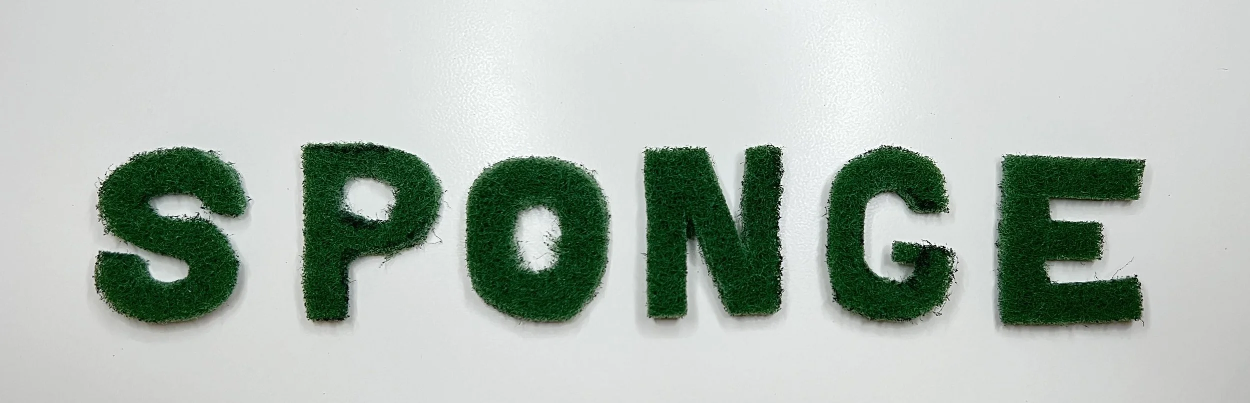
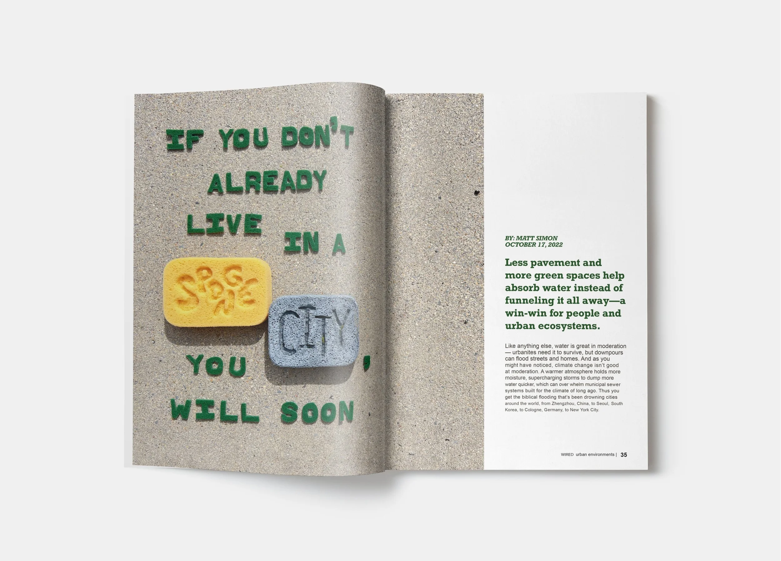
Typography is something that can be boring or extraordinary. For this project I wanted to physically build something that communicated the title and idea through appearance and materiality. After a process of trial and error I got to the final iteration as seen on the cover of the article!
-
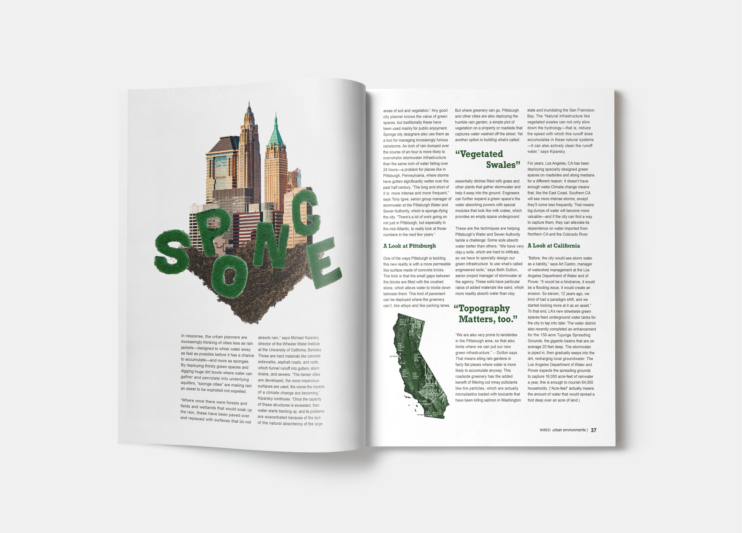
The purpose of a photoshop collage in this editorial is to create imagery for the reader that is both intriguing, informative, and left up for interpretation. It provides a more complex visual component to entertain and challenge the reader.
-
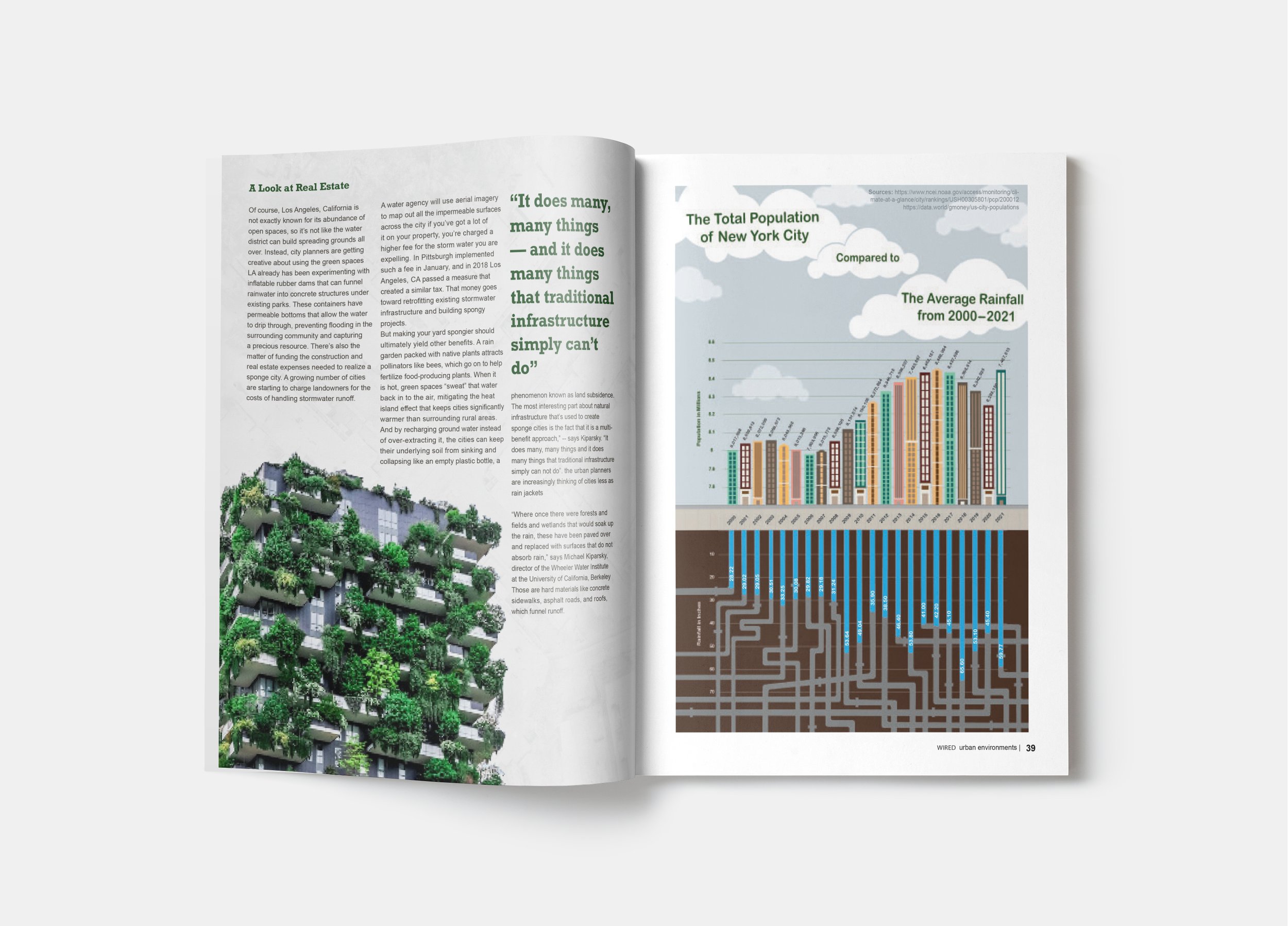
Infographics are useful in showing not so pretty information, statistics, or data in a way that is, yes, interesting. But more importantly, easily digestible. My infographic demonstrates the juxtaposition between two sets of information that both push the context of the article that much further.
Type as Image
Process

Associative Word List/Mapping
Final
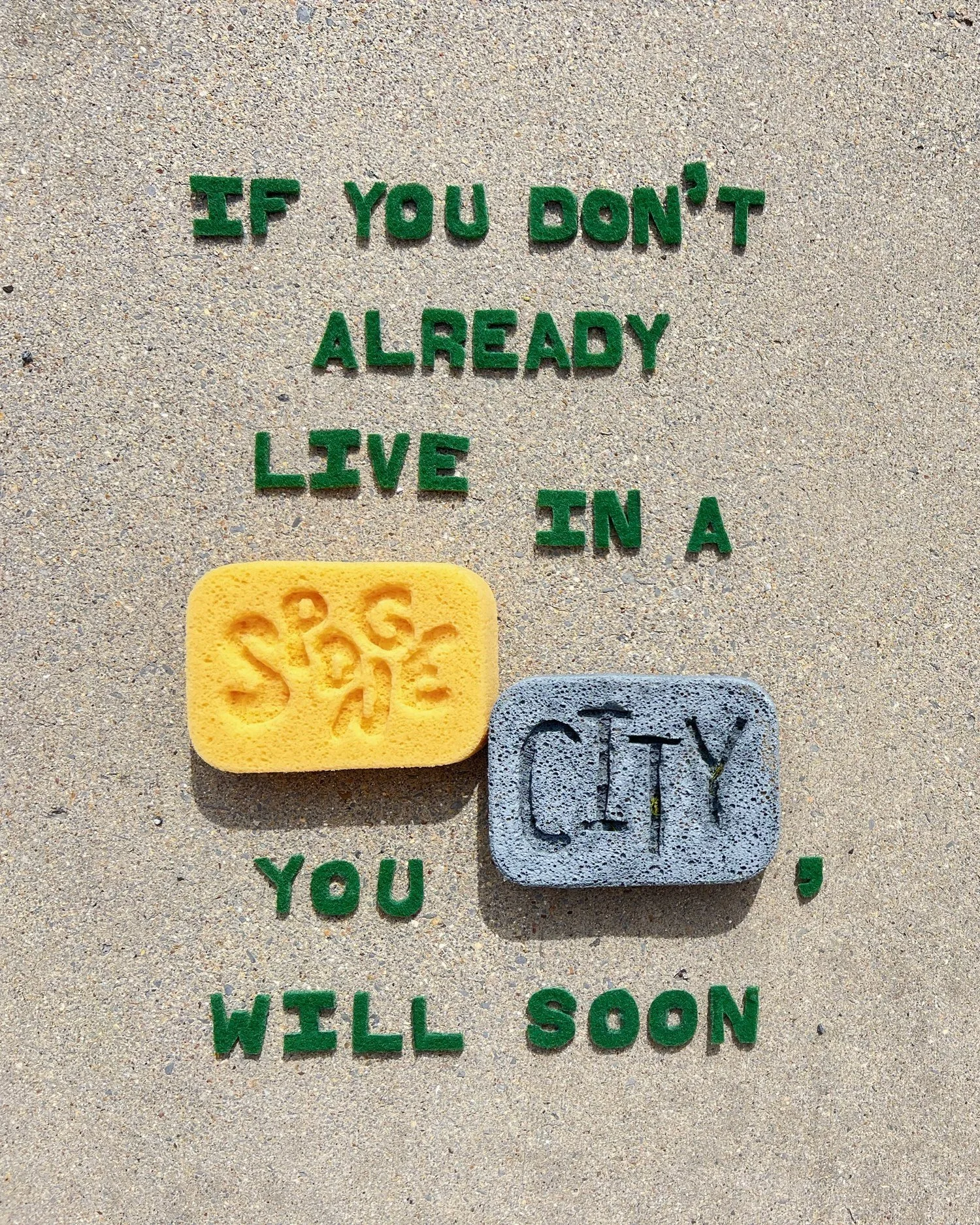

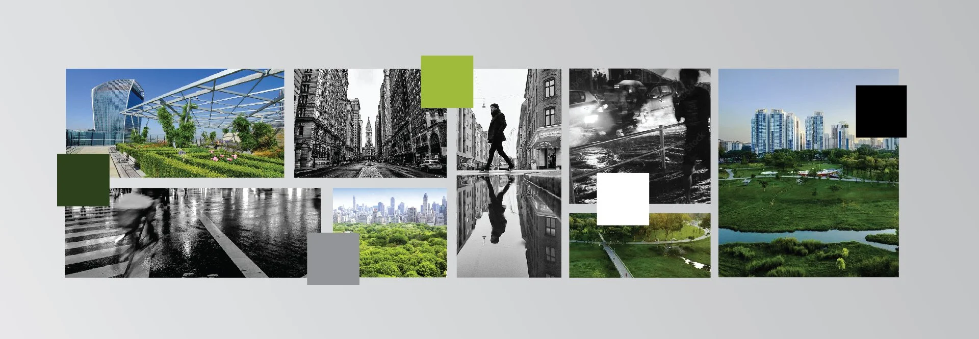
Image Studies/Mood Board/Color Studies
Infographic
Process


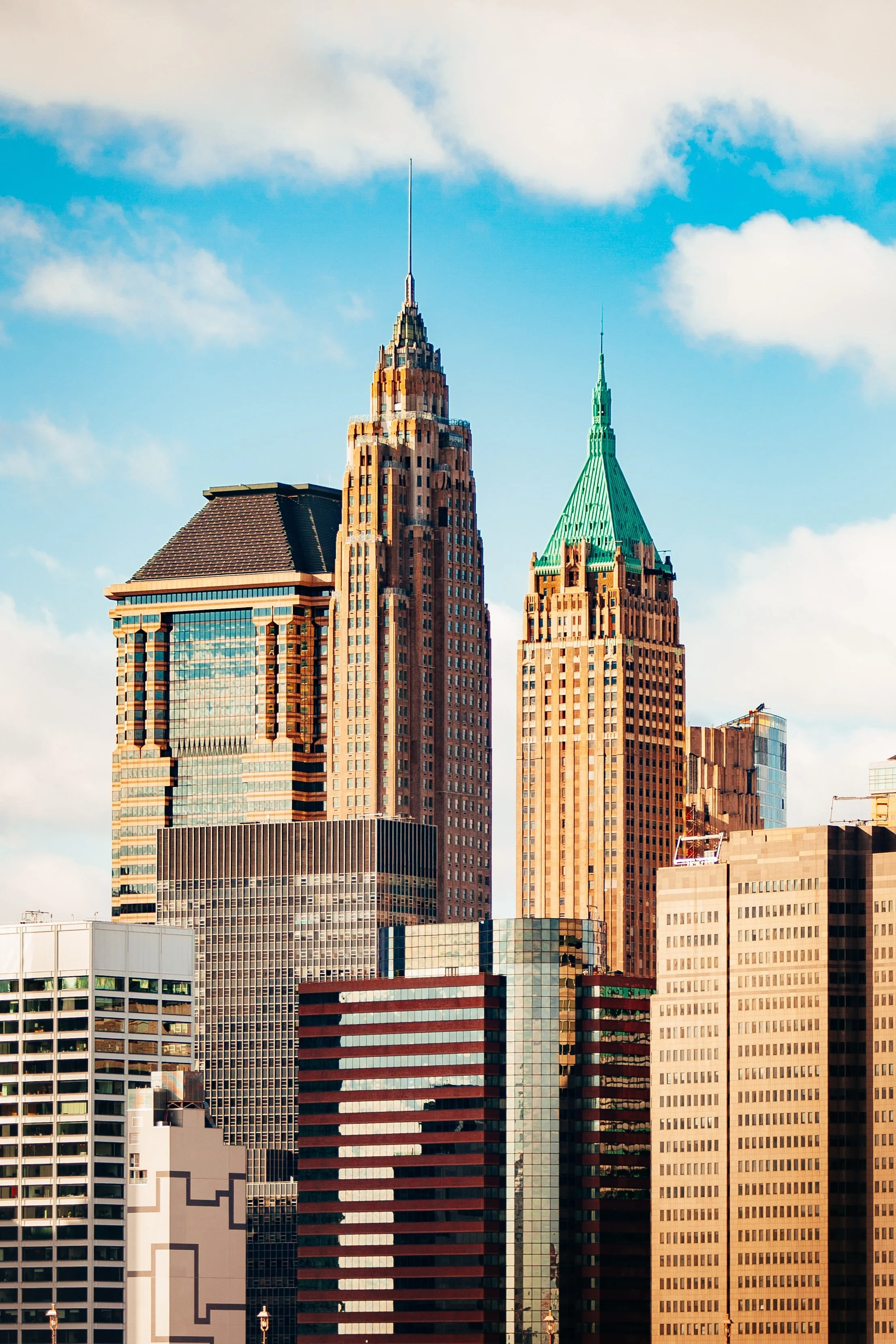
Photoshop Collage Elements
Final

Photoshop Collage


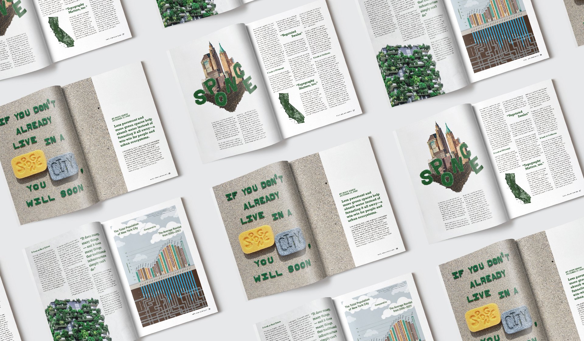
Final Spreads
InDesign | Photoshop | Illustrator | Excel